

The best temporary tattoos that look real combine believable artwork, natural-looking color, sharp printing, and a surface film that does not create distracting glare. Placement and application matter too: even a well-made design can look artificial on a deep crease or after an uneven transfer. Before buying, inspect real-skin photos for color, clarity, edges, and reflected shine.
What Should You Look for in a Realistic Temporary Tattoo?
“Realistic” is not a single product feature. Part of the result is built into the tattoo: its artwork, printed color, edge clarity, and visible surface finish. The rest happens when you use it: the design must suit the body area, transfer completely, lie flat, and dry without distracting wrinkles or shine.
| What to inspect | More convincing sign | Warning sign | Where to verify it |
|---|---|---|---|
| Design | Readable linework, balanced detail and believable proportions | Dense detail that turns muddy at the intended size | Full-sheet image plus an unedited close view |
| Color | Black, gray or color that looks intentional on skin | Unnatural blue-green cast or excessive saturation | Real-skin photos in ordinary light |
| Printing | Crisp edges and separated small details | Fuzzy lines, color misalignment or blurred detail | Sharp close-up of the actual printed product |
| Placement | A motif that fits a relatively smooth body area | Complex artwork compressed into a crease or moving joint | Exact motif measurements or trustworthy real-skin views |
| Application | Complete, flat transfer with clean edges | Missing sections, trapped moisture, wrinkles or lifted edges | Application instructions and a fresh real-skin result |
| Surface film | Reflection that stays quiet under normal viewing light | A broad plastic-looking highlight or visible clear border | Normal-distance and close photos under more than one light |
First Decide What “Looks Real” Means for You
Closest to traditional ink
If your goal is a traditional tattoo impression, start with restrained black or gray linework, controlled shading, and enough negative space for the design to stay readable. More detail is not always better. When a small motif contains too many fine elements, the printed result can look like a dark patch rather than intentional linework.
Natural on skin without copying permanent ink
A muted botanical or minimal color design can look integrated and intentional without resembling permanent black ink. In this case, “real” means visually comfortable on the skin rather than likely to be mistaken for a permanent tattoo.
Intentionally decorative
Metallic, watercolor, celestial, and ornamental temporary tattoos can look polished while clearly reading as fashion body art. That is a different success condition, not a lower-quality result. Choose the category that matches your intended look instead of asking every finish to imitate black ink.
Six Things That Decide Whether a Temporary Tattoo Looks Real
1. Design: does the artwork suit the intended size?
Look at line weight, shading, negative space, and detail density. A convincing design remains readable at the size of the individual motif. Do not use the complete sheet dimensions as the motif dimensions; a large sheet can contain several very small designs.
2. Ink and color tone: do the printed colors look natural on skin?
Color can reveal a tattoo even when the edges are clean. A black that photographs strongly blue, a gray that looks unusually cold, or a highly saturated color may feel artificial for an ink-like goal. Skin tone, lighting, and camera processing can change the impression, so compare more than one real-skin image when possible.
3. Printing: are the lines genuinely clear?
A strong digital design can lose realism during production. Fuzzy edges, weak color registration, banding, or muddy small details are visible warning signs. Shoppers usually cannot verify the seller’s printer, ink system, or resolution claims independently, so judge the output: the actual printed sheet and sharp, unblurred close-ups.
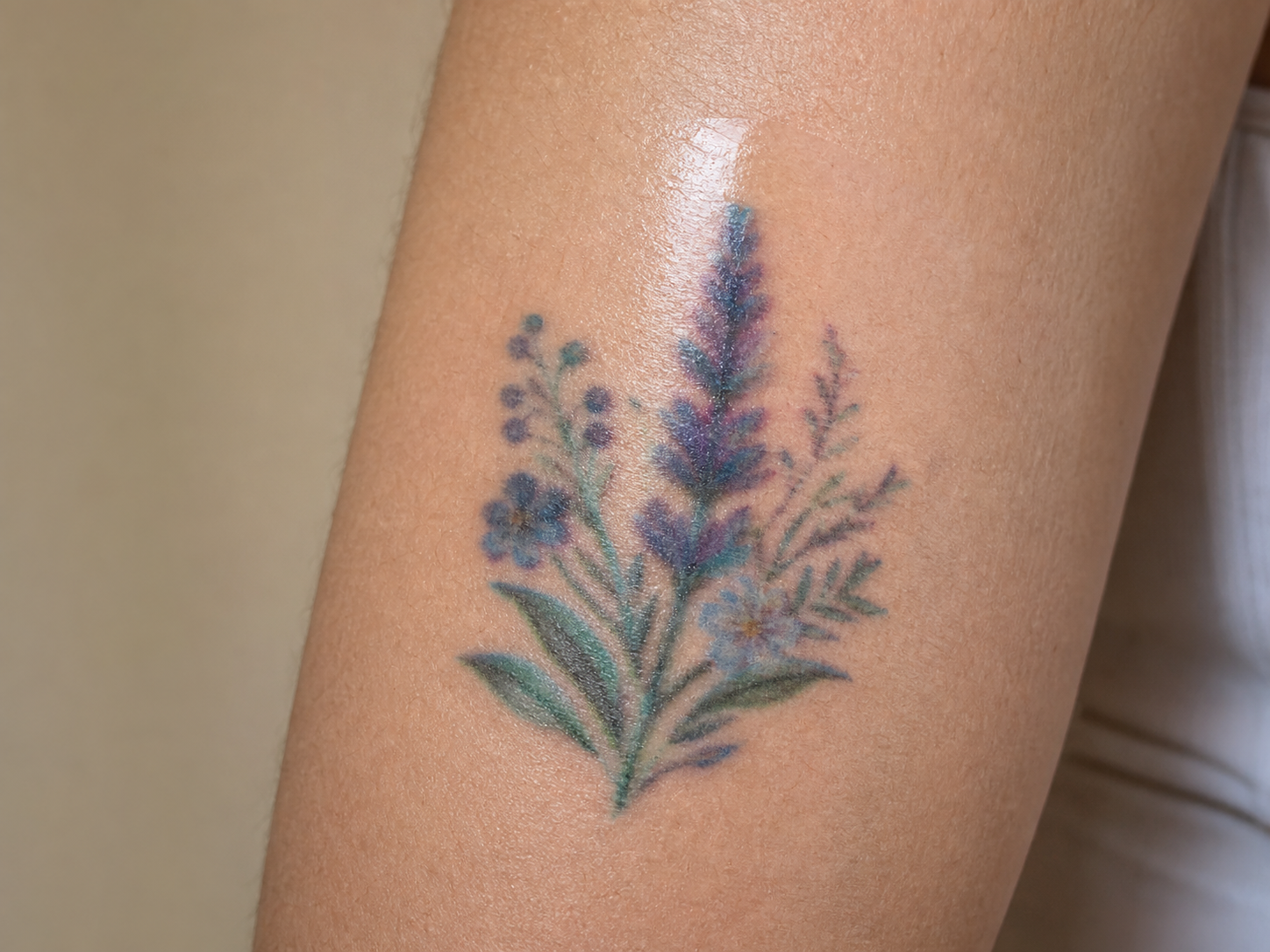
4. Placement: does the motif fit the body area?
Smoother, lower-movement areas generally give a flat transfer more room to remain visually coherent than deep creases and frequently bending joints. The design also needs believable proportion. Use exact motif measurements or a trustworthy real-skin view; never infer individual size from the full sheet alone. Our temporary tattoo placement guide explains the body-area trade-offs in more detail.
5. Application: is the transfer complete, flat, and dry?
Good artwork cannot hide an incomplete transfer. Missing fragments, wrinkles, trapped moisture, or lifted edges can make the decal boundary obvious. Apply the exact product according to its instructions, press evenly, and let the result dry before judging it. For the full process, use our temporary tattoo application guide.
6. Surface film: does reflected light reveal the decal?
Some water-transfer decals can show a clear surface layer or border, especially under direct light or flash. Letting the transfer dry fully may reduce fresh surface shine, but it does not turn every product into a universally matte finish. Check real-skin photos at normal distance and close range. Our photo-realism guide explains why soft light is usually more forgiving than direct flash.
Which Temporary Tattoo Type Matches Your Goal?
For the closest traditional-ink impression, compare restrained fine-line or minimal water-transfer designs first, then verify color neutrality, print clarity, motif scale, application evidence, and surface reflection. For a soft natural accent, compare muted botanical or restrained-color designs. For an event or fashion statement, metallic and watercolor finishes may be the more honest choice because decorative impact—not permanent-ink imitation—is the purpose.
Stain-style products such as henna or jagua belong to a different product category with different application and fading behavior. The FDA distinguishes decal temporary tattoos from henna and related products; confirm the exact product type and ingredient information instead of assuming that every “temporary tattoo” works the same way.
What Should You Inspect on the Product Page?
Look for the complete sheet, a sharp close-up of the actual printing, individual motif measurements when available, and real-skin views at useful distances. Check whether the color changes dramatically between images and whether a broad highlight hides the tattoo surface. Heavily edited close crops, unclear scale, missing sheet views, and unsupported “looks exactly real” language are reasons to pause.
Also confirm the product type, current ingredient declaration, directions, and seller terms. FDA notes that retail cosmetics require ingredient labeling and that reactions to some decal temporary tattoos have been reported. That does not mean every decal causes a reaction, but it is a reason to follow the exact label and avoid unsupported “universally safe” claims.
What Can Beauty of Papers Show Honestly?
From a Beauty of Papers catalog-review perspective, the most useful evidence is not the word “realistic.” It is the combination of a complete-sheet image, a clear view of the printing, accurate product-type information, and real-skin placement photos where available. Product manufacture and user execution can fail independently: good artwork can be weakened by color, printing, or surface reflection, while a well-made tattoo can be weakened by unsuitable placement or incomplete application.
The Minimal Botanical Temporary Tattoo Sheet is a qualified example of a quiet watercolor botanical design with current real-skin gallery views. Its listed 108 × 180 mm measurement belongs to the complete sheet, not to an individual motif. It should not be described as a black fine-line tattoo, a universally matte product, or the closest possible imitation of permanent ink.
Summary
The most convincing temporary tattoo is supported by both product quality and good use. Check the design, ink or color tone, print clarity, placement, application, and surface-film reflection. If the product photo already shows unnatural color, fuzzy printing, or a broad plastic-looking highlight, placement alone will not fix it. If the product looks sound, choose a suitable body area and apply it completely before judging the final result.
What the guide images show
Key visual information is repeated below as text so the design, scale, placement, and process do not depend on images alone.
- A content-led editorial image illustrating a restrained, convincing temporary-tattoo look. It is not an exact product or permanence test.
- Close-up of a fictional temporary tattoo with an unnatural cool color cast and blurred printed lines on an adult arm
Leave a Reply