
Temporary tattoo colors can look different across skin tones, but skin tone is not the only thing changing in a product photo. The design itself, the light, the camera’s white balance, and whether the finish is printed or metallic all affect what you see.
That means a photo can help you choose, but it should not be treated as a universal color chart. The most useful approach is to read the photo in context, then compare it with a full-sheet image of the same product.
Skin Tone Matters, but the Photo Has More Than One Variable
A red printed flower, a silver band, and a gold celestial design do not interact with light in the same way. Printed colors are visible because of their pigment and contrast. Metallic-looking details also depend on reflection: move the light or the camera, and the brightest area can move with it.
The camera adds another layer. White balance is designed to compensate for the color of the light, and different settings can make a scene look warmer or cooler. Nikon’s explanation of white balance shows how the same scene can shift under different light and camera settings.
This is why two photos should not be ranked by skin tone alone when they also show different products, locations, and lighting. Instead, ask three smaller questions:
- What color or reflection is actually visible?
- What kind of light is creating that view?
- Is the photo showing the same product you plan to buy?
Three Real-Use Photos, Read One at a Time
We reviewed three Beauty of Papers real-use photos. They show a red printed design, a mixed gold-and-silver design, and a metallic-gold design on three visibly different skin-tone ranges. They are useful examples, but they are not a controlled comparison. Each photo has its own product, placement, light, and camera conditions.
A red rose in indoor daylight
The K7115 photo shows a red rose with dark leaves at the side of the neck on visibly light skin. The photo was taken indoors with daylight. In that setting, the red petals remain easy to separate from the darker leaf shapes, so the motif reads clearly at a glance.
What this photo tells you: the red-and-dark printed design is visible in this daylight image, and the rose keeps a clear focal shape near the face.
What it does not tell you: it cannot prove that red is always the best choice for light skin, predict the same red under warm evening light, or show how every rose design will look. It is one view of one product.

Gold and silver bands in warm studio light
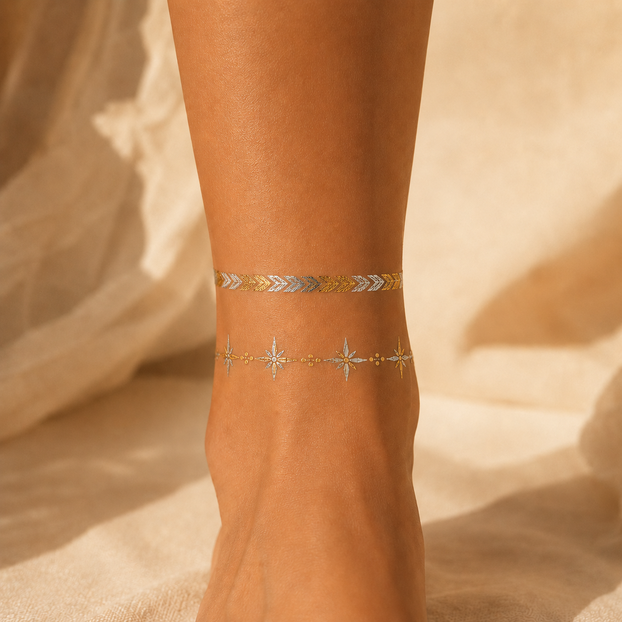
The K083 photo shows gold- and silver-toned bands at the ankle and top of the foot on visibly warm medium-to-tan skin. The warm studio light gives the whole scene a warmer cast, while separate bright areas help the two metallic tones remain visible.
Look closely at where the bands become brightest. That highlight is part of the metallic effect; it is not simply a flat printed color. If the light moved, the reflection could move too.
What this photo tells you: both gold- and silver-toned details are visible in this particular warm-light view, and the design reads as a jewelry-like ankle accent.
What it does not tell you: it does not rank gold against silver for warm or tan skin. It also cannot show how the same bands would look in cool daylight, under direct flash, or on another person.
A metallic-gold celestial design in warm outdoor light
The K009 photo shows metallic-gold stars and moon shapes across an upper arm on visibly medium-deep to brown skin. Warm outdoor light creates bright points along the gold details, while the open spacing keeps the celestial shapes readable.
What this photo tells you: the gold reflection and the outlines of the celestial motifs are visible in this outdoor image. It also shows how the design reads as an open composition rather than one solid block of color.
What it does not tell you: it cannot guarantee the same contrast on every medium-deep or brown skin tone. It is not a size chart, a wear test, or a promise that every metallic-gold product reflects light in the same way.

Read Printed Color and Metallic Shine Differently
When you look at a printed red, blue, green, or black design, first check whether the edges and small details remain clear against the skin in ordinary light. If the color seems very different between photos, compare the background and the light before assuming the product changed.
For metallic-looking designs, find the highlight. A genuine reflective effect should respond to the direction of the light, so one part may look bright while another looks quieter. A single flat image can still be useful, but a second angle or a photo under another light gives you more information.
This distinction also helps you avoid the wrong comparison. A red printed rose and a gold reflective band solve different styling jobs. One gives you a stable color-led motif; the other uses changing light as part of the look. Choose the effect you want before trying to name one finish as universally more flattering.
If your larger question is whether the design looks convincing rather than how its color reads, use the guide to temporary tattoos that look real. It covers print clarity, edges, placement, application, and surface shine as a complete realism check.
Use the Same-Product Two-Photo Check
Before buying, try to find two views of the same product:
First, inspect the full sheet. This tells you which motifs are included and whether the product is printed color, metallic-looking, or a mixture. Do not use the size of the whole sheet as the size of one motif.
Then, inspect a real-use photo of that same design. Look for clear edges, readable details, and the way the finish behaves in the stated light. If the worn photo shows a different design, it can inspire a look, but it cannot verify the product in your cart.
The two views answer different questions. The sheet shows what you receive. The real-use photo shows how that specific artwork can read on skin in one real setting. Together, they are more useful than either image alone.
If you are still choosing between floral, celestial, ornamental, or minimal artwork, start with the temporary tattoo design guide. It helps narrow the visual direction before you inspect the photos for a specific sheet.
Know When the Photo Is Not Enough
Pause before buying when the listing shows only a heavily edited close-up, leaves out the full sheet, or uses a worn image that cannot be matched to the product. You may still like the idea, but the image is not giving you enough information to judge that exact design.
A screen also cannot promise a perfect color match. Display settings, photo editing, and room light can all affect what you see. Product photos are best used to judge broad color direction, visible contrast, print clarity, and the presence of metallic reflection—not an exact shade measured from your screen.
The same limit applies to skin tone. A current temporary-tattoo FAQ from Sticker Mule notes that appearance may vary by skin tone. That is a useful starting point, but it is not enough to predict one result for every person. A trustworthy choice stays tied to the exact product photos available.
Choose the Finish After You Choose the Evidence
If you want a color-led floral or graphic accent, browse the Beauty of Papers Shop and look for a full-sheet image plus a matching real-use view. If you want light-catching gold, silver, celestial, or band details, use the same check while browsing Metallic Temporary Tattoos.
Do not ask one photo to answer every question. Use it to understand one product under one set of conditions, then compare another view of the same design. That small change—from searching for a universal skin-tone rule to reading the actual product photos—leads to a more confident and more honest choice.
Sources and review method
Beauty of Papers Editorial reviewed three provenance-checked real-use product photos: K7115 in indoor daylight, K083 in warm studio light, and K009 in warm outdoor light. The visible skin-tone descriptions are observational, not standardized skin-color measurements. The article also uses current public guidance on temporary-tattoo appearance and camera white balance, linked above.
What the guide images show
Key visual information is repeated below as text so the design, scale, placement, and process do not depend on images alone.
- Red rose temporary tattoo at the side of an adult neck in indoor daylight
- Gold- and silver-toned temporary tattoo bands at an adult ankle in warm studio light
- Metallic-gold celestial temporary tattoo on an adult upper arm in warm outdoor light