

The best temporary tattoo design is the one that fits four things: what you want it to do, how noticeable you want it to be, how much space you have, and what the actual product looks like at real scale. Use the decision tree below to move from a general preference to a practical design family without relying on a trend list.
If you are not yet sure whether a tattoo idea suits you—or whether you want a tattoo at all—begin with Why Choose Temporary Tattoos?. Return here once you are ready to compare design families.
Use This Four-Question Decision Tree
1. What do you want the temporary tattoo to do?
Start with the job, not the motif. A flower, moon, butterfly, or ornamental band can all work well, but they create different results depending on why you are wearing them.
- Everyday accessory: You want something that can sit quietly beside your clothing or jewelry. Begin with a small minimal, botanical, or fine-line-style design.
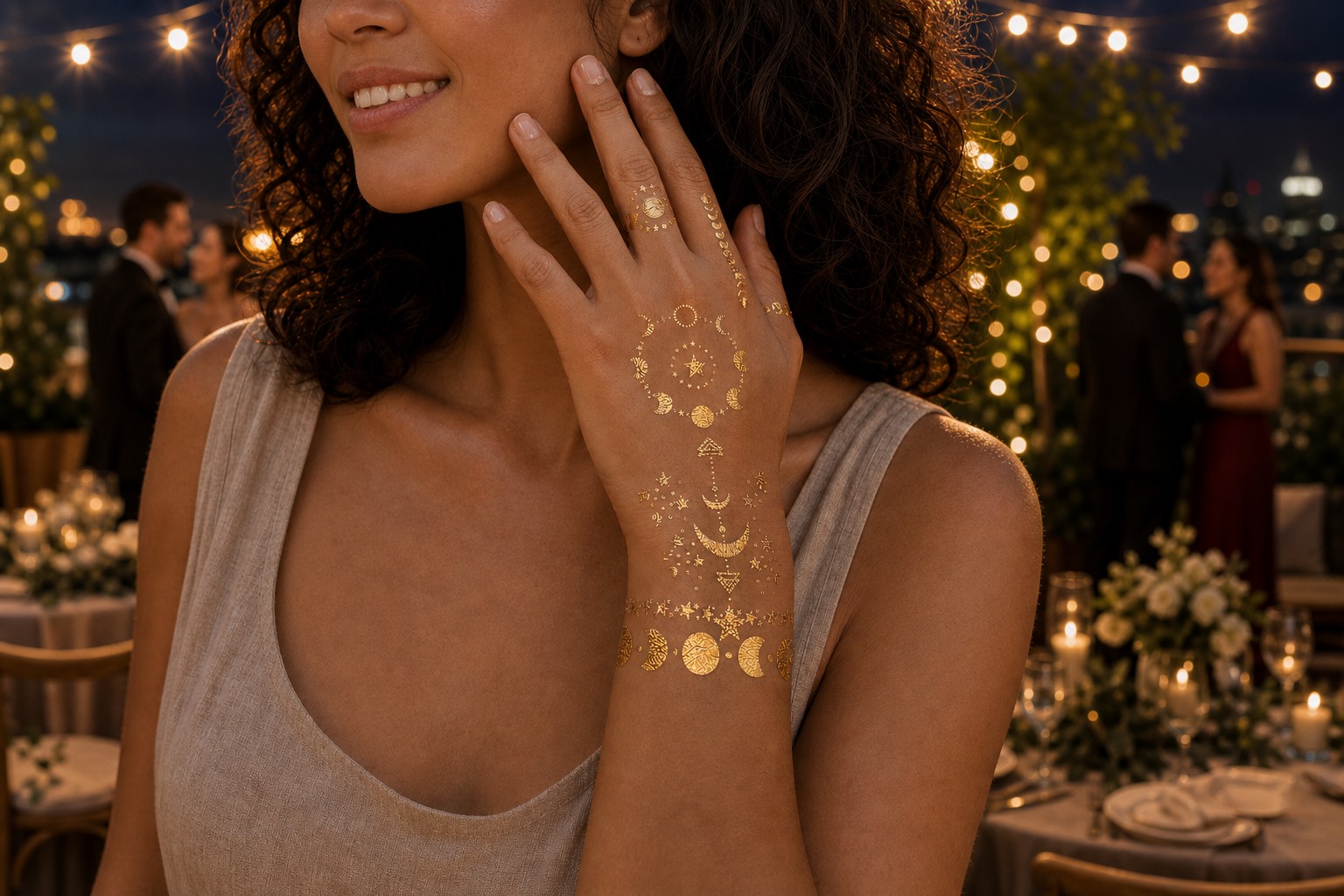
- Occasion or photo accent: For a wedding, use our wedding temporary tattoo buyer’s guide; for parties, festivals, and evening looks, consider a clearer focal point such as metallic, celestial, or ornamental artwork.
- Soft personal expression: You prefer a romantic, natural, or color-led look. Floral, watercolor, and butterfly temporary tattoos are the most direct families to compare.
- Trial before permanent ink: You want to observe how a tattoo idea feels on your body. Prioritize a comparable scale and placement instead of expecting a water-transfer finish to reproduce a healed permanent tattoo.
Temporary tattoos do not need to look childish on an adult. The more useful question is whether the design, scale, and placement support the way you intend to wear it.
2. How much visual impact do you want?
Next, decide how quickly the design should attract attention. This narrows the catalog more effectively than choosing a motif first.
- Low impact: Choose more open spacing, lighter visual weight, or a small single motif. The Minimal Botanical Temporary Tattoo Sheet is a useful current example of an airy botanical direction.
- Soft and color-focused: Compare floral and watercolor artwork. The Red Rose Floral and Watercolor Butterfly sheets show two different ways to create a softer visual focus.
- Reflective or statement-focused: Look at metallic, celestial, and ornamental designs. A Gold Moon and Star accent reads differently from a longer Metallic Ornamental Band.
Do not assume that one finish will look identical on every person or under every light. Use the current product photographs to judge color, line density, spacing, and metallic details before choosing.

3. How much space and visibility do you have?
A design that looks balanced on a product sheet may feel crowded in a small placement or too quiet in a larger one. Decide whether the available area is small, medium, or long and curved.
- Small or discreet area: Start with a compact accent that does not require several elements to be understood.
- Medium readable area: A clearer floral, butterfly, botanical, or celestial motif can use more visible space without becoming a band.
- Long or curved area: Consider repeating elements or an ornamental band whose direction fits the space.
If the placement is fixed, determine the usable space before selecting the design. If you are flexible about placement, choose the visual effect first and then find an area that supports its shape. For a fuller placement discussion, use the guide to the best places to put a temporary tattoo.
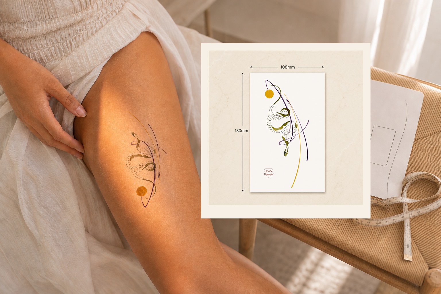
Remember that a product sheet’s dimensions describe the complete sheet, not each individual motif. Individual scale, orientation, and spacing still need to be checked in the product photographs or with a reliable scale reference.
If you are deciding between one statement tattoo and several smaller accents, read our focal-versus-cluster composition guide before choosing the final design size.
4. Which design family matches your answers?
Combine the first three decisions instead of treating style, occasion, and placement as separate checklists:
- If your goal is an everyday accent, your preferred impact is subtle, and your available space is small, begin with minimal or botanical designs.
- If you want a soft or romantic result with some color, compare floral, watercolor, and butterfly designs in a small or medium scale.
- If the tattoo should contribute to event styling or photographs, compare metallic, celestial, and ornamental designs that suit the visible area.
- If you are testing a future tattoo idea, prioritize comparable scale, direction, visibility, and placement. The guide to testing permanent tattoo placement explains the limits of that comparison.
Compare the Four Main Design Paths
Use the decision tree above to narrow the mood: minimal or botanical for a subtle accent, floral or watercolor for a softer look, and metallic, celestial, or ornamental for more impact. For a broader shopper-friendly comparison of these looks and the product types behind them, see our temporary tattoo style guide.
Verify the Actual Product Before You Choose
Before buying, check the current product photos, full sheet dimensions, motif count, finish, and placement notes. For the detailed realism rubric—including color, print clarity, placement, application and surface-film reflection—use our guide to choosing temporary tattoos that look real. The temporary tattoo styles and product types guide keeps the broader product comparison, while this decision tree remains the owner of purpose, impact, space and visibility.
Summary
A good temporary tattoo choice begins with purpose, then moves through visual impact, available space, and verified product details. Minimal and botanical designs generally support quieter styling; floral and watercolor designs create a softer color-led direction; metallic, celestial, and ornamental designs provide a stronger decorative focus; and trial use should prioritize comparable scale and placement. Checking the real product image, motif size, finish, and application conditions turns a broad style preference into a practical choice.
What the guide images show
Key visual information is repeated below as text so the design, scale, placement, and process do not depend on images alone.
- Begin with purpose and visual impact before choosing a temporary tattoo motif family.
- Watercolor butterfly temporary tattoos worn on the forearm at an adult garden gathering
- Gold celestial temporary tattoos reflecting warm light at an adult evening reception
- An adult evaluating a botanical temporary tattoo on the thigh beside its verified 108 by 180 millimeter product sheet