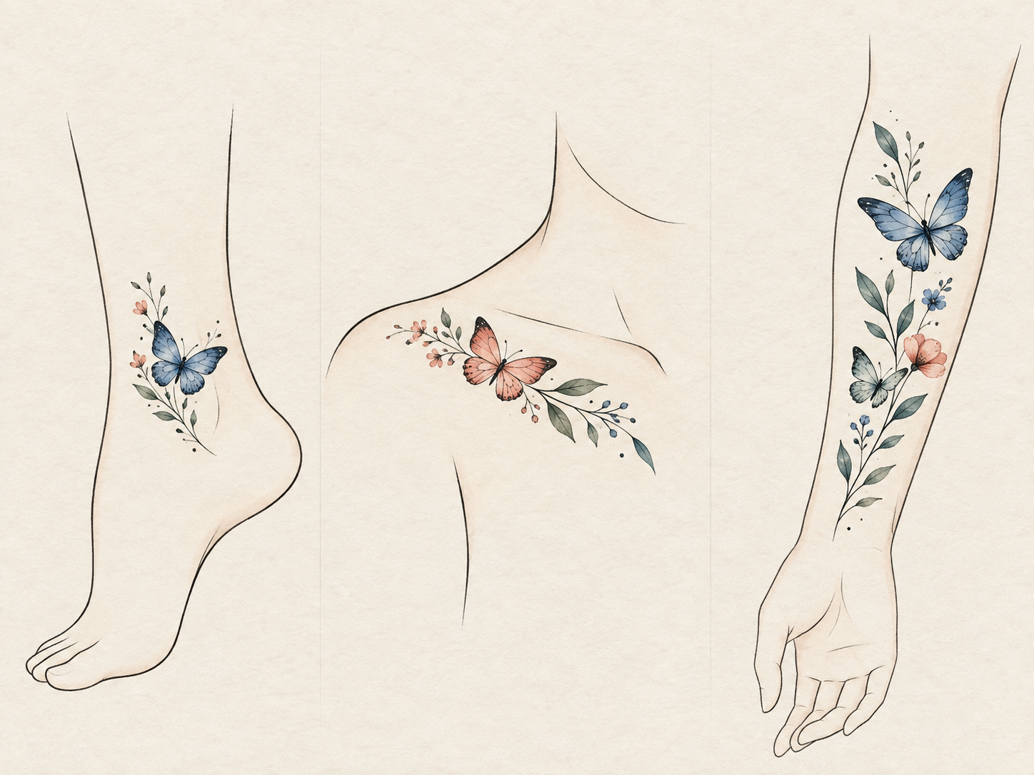
Choose a butterfly or nature temporary tattoo by following the artwork's direction before naming a body area. A compact motif can read as a small, deliberate accent, while a longer or more open design needs enough uninterrupted space for its movement to stay legible. Start with the visual role you want the design to play, then browse the sheet that supports it.
Start With the Motif's Direction, Not a “Best Spot”
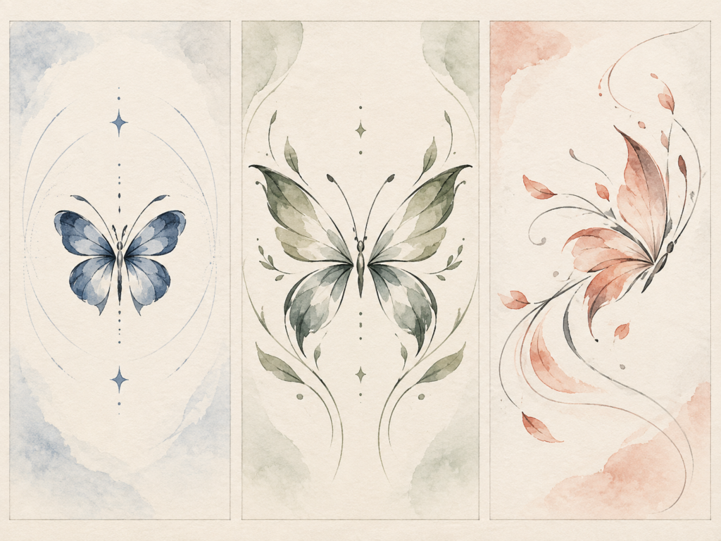
There is no universal best placement for every butterfly. A design with a clear upward or diagonal flight path asks the eye to travel; a compact butterfly reads more like a punctuation mark; a botanical or ocean-inspired piece may need a calmer field around it. Before comparing wrist, ankle, shoulder, or forearm, look at three things:
- Direction: Does the artwork look as though it rises, travels across, or opens outward?
- Visual density: Is it a single light accent or a fuller illustrated shape?
- Visibility: Do you want a small detail that appears in motion, or a more open composition that stays visible from the front?
That check keeps the choice about composition rather than a promise that one location will suit every design or every person.
When a Butterfly Feels Right on the Wrist or Ankle
The wrist and ankle work well when you want the design to feel like a concise finishing detail. A small butterfly, a narrow trail, or one clearly directed form can use the length of the area without asking the viewer to take in a large scene all at once.
For a wrist, let the design's direction follow the arm instead of forcing a broad motif into a tight visual space. For an ankle, think about how much of the artwork you want visible from the front, side, or back as you move. The aim is not to make the tattoo imitate jewelry; it is to give a small motif enough room to read cleanly.
If you are deciding between several designs on one sheet, make the body-area choice first and then choose the motif that has the right amount of visual weight. For a wider question about body areas, use the temporary tattoo placement guide alongside this motif-focused approach.
Use Collarbone or Shoulder Space for an Open Composition
Collarbone and shoulder areas can give an open butterfly or nature motif more breathing room. Here, the useful question is whether the artwork has a shape that can sit with the body's line rather than compete with it. A motif that opens outward can feel intentional when it has clear empty space around it; a compact design may look more considered when it stays closer to one side instead of trying to fill the whole area.
Keep this decision visual. Neckline, garment coverage, and the amount of skin you want to leave unadorned are better guides than a one-size-fits-all placement rule. If a floral composition is your main focus, this floral styling guide is the better next read; it handles outfit coordination rather than butterfly and nature motif direction.
Let a Forearm Placement Carry a Longer Motif Story
The forearm gives a longer visual path when a design suggests travel, water, leaves, or a sequence of forms. Instead of treating the entire forearm as a blank canvas, decide whether the artwork should point toward the wrist, toward the elbow, or sit as one centered focal mark. That choice changes the reading of the same design more than adding extra decoration does.
This is also a good place to resist turning one motif into a cluster by default. If you are choosing between a single focal design and several smaller accents, see one large temporary tattoo or several small accents. The decision there is about grouping; here, the job is simply to match one butterfly or nature-inspired visual path to the space available.
Choose a Starting Sheet After You Choose the Area

Beauty of Papers' Butterfly & Nature collection provided three relevant product pages when checked on September 9, 2026: Watercolor Butterfly, Watercolor Whale, and Minimal Botanical. This is a catalogue observation, not a wear, scale, or placement test.
Use the listing imagery to compare motif character after you have chosen your visual role:
- A butterfly can support a compact accent or a more directional composition, depending on the specific artwork shown on the sheet.
- A whale or other flowing nature motif may call for a longer visual path rather than a small isolated detail.
- A minimal botanical design can work when you want the artwork to feel quieter and leave more open skin around it.
The exact artwork on a product page should make the final call. Browse the Butterfly & Nature collection for this motif family, or visit the Shop if you want to compare it with other styles.
Make One Final Visual Check Before You Apply
Hold the chosen motif near the intended area and check three things in a mirror or a photo: whether its direction still makes sense from your normal viewing angle, whether the surrounding space feels intentionally open, and whether nearby clothing leaves the amount of visibility you wanted. If the answer is no, changing the area is often more useful than adding another motif.
For transfer steps and skin preparation, follow the temporary tattoo application guide. If you are using a temporary design to think through a future permanent tattoo, the try-before-ink guide covers that different decision in more depth.
The simple rule is to let the butterfly or nature motif lead: compact designs need a small, deliberate moment; open or flowing designs need room for the eye to travel. Once that visual choice is clear, the right sheet and the right area become easier to narrow down.
What the guide images show
Key visual information is repeated below as text so the design, scale, placement, and process do not depend on images alone.
- Editorial placement illustration; it shows visual-composition ideas, not product scale or a wear test.
- Editorial diagram comparing compact, outward-opening, and flowing motif directions with surrounding open space.
- Watercolor Butterfly temporary tattoo sheet shown as current Butterfly and Nature collection context.