
Choose a temporary tattoo for the distance at which the audience needs to read it. A small detailed design can work as a close-up accent, while a bolder outline or stronger color contrast is easier to recognize when the performer is farther away. Start with the tattoo’s job in the full costume, then compare the actual product artwork before you choose.
This is a visual-planning decision. Stage lighting, sweat, movement, and wear time need their own tests and cannot be predicted from a product image.
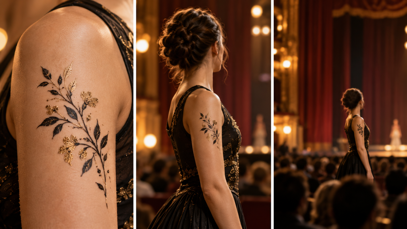
The same kind of detail can read very differently as the audience moves farther away; use the comparison to judge visual role, not product performance.
Start With the Audience Distance
Think about the farthest viewer who still needs to notice the tattoo. A front-row audience may see small interior lines, but those details can merge into one shape from farther back. If the tattoo only needs to reward a close view, fine detail can still be useful. If it carries a character cue that must read across the room, give the overall silhouette more importance.
Distance also changes how much responsibility the tattoo should carry. A small accent may support makeup, a costume edge, or jewelry without becoming a separate focal point. A larger or higher-contrast motif can take a clearer role, but it still needs enough open visual space around it.
Choose One Stage Role for the Tattoo
Give the tattoo one main job before comparing motifs:
- Character focal point: The tattoo should be one of the first details the audience notices.
- Costume echo: The motif repeats one shape, color, or decorative idea already present in the costume.
- Ensemble marker: Several performers use a related visual cue without requiring the audience to inspect every detail.
When one tattoo is asked to do all three jobs, the choice usually becomes less clear. Pick the strongest role and let the costume handle the rest.
Compare Silhouette, Contrast, and Visible Scale
Begin with silhouette. A sun, star, band, flower, or geometric cluster can remain recognizable even when its smallest lines are no longer visible. Next, compare contrast between the artwork and the surrounding costume or visible skin area. Contrast is a design choice, not a promise about how the tattoo will look under every light.
Then check the size information and product photos on the actual listing. The Beauty of Papers Shop lets you inspect current artwork, color, finish, and stated sheet details. Do not estimate a finished stage result from a cropped product image alone.
Use the Stage-Distance Read Check
Use four checks in order: role, distance, silhouette, and contrast.
- Write one sentence describing the tattoo’s role in the costume.
- Name the farthest audience zone that needs to understand that role.
- Reduce the motif to its outer shape. Ask whether that shape still carries the idea.
- Compare one clear contrast choice, such as light against dark or color against a quiet costume area.
This check is most useful when you apply it to real products. It turns a broad style preference into a short list you can inspect instead of treating every detailed sheet as equally suitable for the same stage job.
Keep Camera Realism and General Style Choice Separate
If your priority is a close photo, use the photo guide for glare, visible edges, and camera-specific choices. For a broad comparison of floral, metallic, fine-line, face, and festival looks, use the temporary tattoo style guide.
For stage distance, return to the simpler question: what must the audience read, and how much detail survives that distance? That keeps the product choice tied to the performance’s visual plan without promising a lighting or wear result that has not been tested.
What the guide images show
Key visual information is repeated below as text so the design, scale, placement, and process do not depend on images alone.
- Editorial illustration for comparing visual role across audience distance; not an exact product, scale, lighting, wear, adhesion, durability, sweat, or performance test.
- Temporary tattoo motif detail compared at near, middle, and far audience distance