Floral temporary tattoos tend to look more deliberate when the shape of the design has room to read. Before you choose a wrist, ankle, collarbone, shoulder, or forearm, look at the motif itself: is it one clear bloom, a curved line, or several small details? That quick check helps you choose an area with a similar amount of open space—then use the placement guide for broader body-area and skin-prep decisions.
Start with the direction of the flower
Do not begin by trying to rank body areas. First, hold the uncut sheet near the area you are considering and notice where the floral design seems to lead the eye.
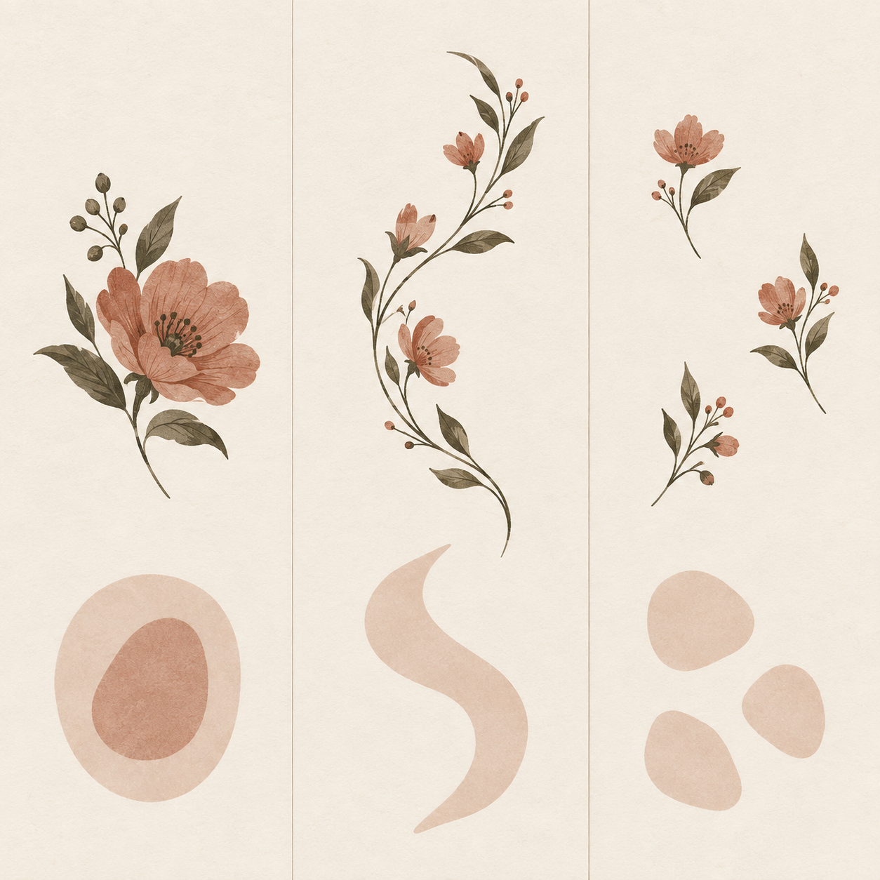
- A single bloom or compact cluster usually needs one quiet patch of skin around it.
- A curved stem, paisley-like detail, or ornamental line can look clearer when it has room to travel rather than being squeezed into a tight corner.
- Several tiny flowers or separate accents can be treated as a small arrangement, with each piece getting its own visible space.
This is a visual planning method, not a promise that one motif will fit every body or product sheet. Check the complete sheet and the product images before cutting out a design.
Use the wrist or ankle for one clear detail
The wrist and ankle are useful when you want a floral element to read as one contained accent. A compact flower, a short curve, or a small separate detail is often easier to assess there than a dense design with several directions competing at once.
For this kind of placement, turn your arm or ankle slightly and look at the sheet in a mirror. Ask whether the flower still has a clear front-facing moment, or whether its best detail disappears around the side. If it needs a long uninterrupted line to make sense, compare a more open area before applying.
Let a collarbone or shoulder support a curve
A collarbone or shoulder can offer a more open visual path for a flower that bends, rises, or spreads outward. The useful question is not whether every floral design belongs there; it is whether the curve of the artwork has a clear direction once you hold it near the area.
Try a simple three-part check before transfer:
- Hold the sheet in its intended direction without peeling the film.
- Take one relaxed standing photo and one photo with your shoulder turned naturally.
- Keep the option only if the main flower or line remains readable in both views.
This check is especially useful for artwork that has a visible top and bottom. It is not a size test, and it does not replace the product page’s own images or suggested areas.
Give a longer floral line room on the forearm or upper arm
Some floral designs include a branch-like flow, a border strip, or a series of details that make more sense as a longer line than as a single small accent. In that case, use the forearm or upper arm as a place to compare the design’s direction against a more continuous stretch of skin.
You do not need to make the whole design run perfectly straight. Instead, look for one main path: upward, downward, diagonal, or gently around an edge. If you cannot point to that path while the sheet is held in place, simplify the plan by choosing one portion of the sheet rather than trying to use every element together.
For general questions about movement, clothing friction, and preparation, return to the placement guide. This page is only about reading floral composition before you commit to an area.
Keep scattered flowers from competing with one another
Several small floral elements can create a light, intentional arrangement, but they need enough separation to be read as separate accents. Place the sheet near the area and decide which piece is the lead detail before you add any supporting pieces.
A simple way to edit the arrangement is to choose one of these roles:
- Lead flower: the piece you want someone to notice first.
- Supporting curve: a smaller element that follows the lead without copying it.
- Quiet space: an uncovered area that keeps the arrangement from becoming a solid block.
If every piece seems equally important, remove one from the plan. A smaller arrangement can make the individual flowers easier to see and gives you more flexibility to change direction before applying.
Compare the actual floral sheets before you decide
On September 17, 2026, the Beauty of Papers Floral Collection displayed eight named sheets, including Pink Lily, Red Rose, Colorful Curved Floral, and Gold Mehndi Floral. Looking across the current collection is useful because it lets you compare a recognizable single flower with a curved ornamental line or smaller separate details before selecting a placement.
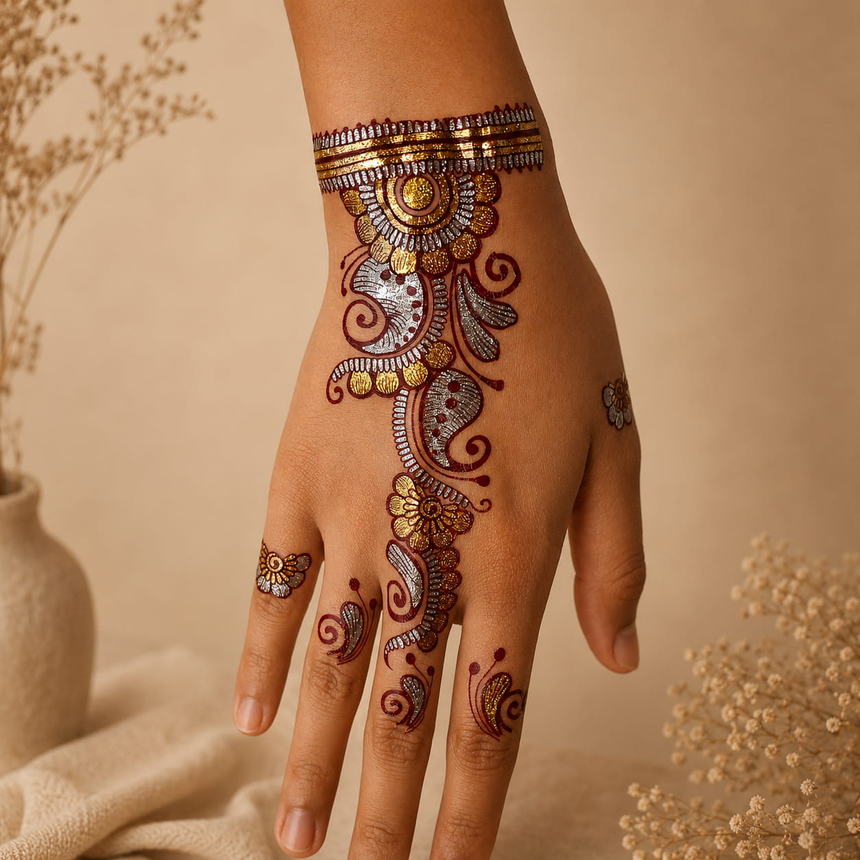
For example, the Colorful Curved Floral sheet is a useful product-page example of curved florals, border-style elements, and smaller motifs. The Gold Mehndi Floral sheet is a useful example of ornamental floral and bracelet-like details. These examples help you inspect the artwork shown on the current pages; they do not prove how an individual motif will fit, wear, or look on a particular person.
Make the placement choice before the transfer steps
Once the motif has a clear direction and enough quiet space, take one last mirror photo with the unopened sheet held in place. If the flower reads clearly at a glance, you have a practical starting point. If it feels crowded, choose a simpler element or a more open area instead of forcing the full design into the first location you considered.
When your placement is settled, follow the temporary tattoo application guide for the water-transfer steps. To compare the current floral designs themselves, browse the Floral Collection.
What the guide images show
Key visual information is repeated below as text so the design, scale, placement, and process do not depend on images alone.
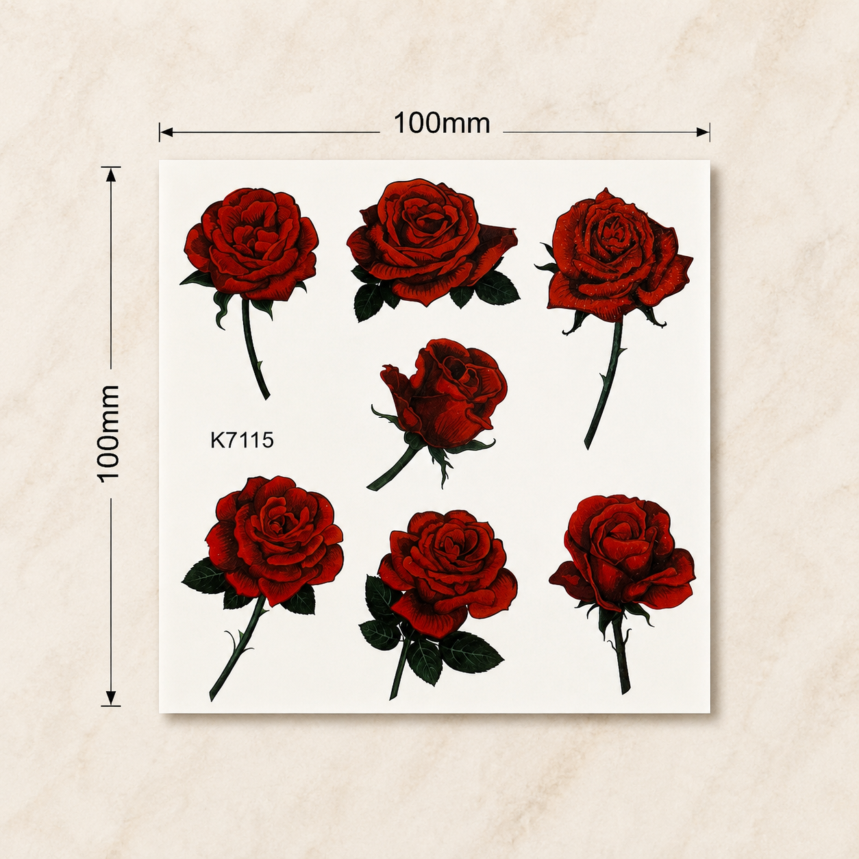
- The sheet photo shows the full red rose floral design and approximate size before application.
- Editorial diagram matching a single bloom, a curved floral line, and small floral accents to contained, continuous, and separated visual space
- Colorful curved floral temporary tattoo shown along the hand and wrist